How might we…
refresh a legacy coffee roaster’s brand and website to better connect with its customers?
Schuil Coffee Co.
Logo and Brand Design, Packaging Design, Website Design
Overview
-
Schuil Coffee Co., based in Grand Rapids, is Michigan’s first specialty coffee roaster, known for small-batch roasting and ethically sourced Arabica beans. Since 1981, they’ve built lasting relationships with farmers and a reputation for quality, integrity, and community, blending tradition with a modern appreciation for great coffee.
-
This project was a collaborative effort between designers, strategists, and the internal Schuil team.
Special thanks to Laura Wilusz for supporting design contributions and packaging efforts.
My Role: Creative Direction
-
3 Months, 2018
Challenge
Schuil Coffee Co. had a 40+ year legacy as Michigan’s first specialty coffee roaster but lacked a visual identity that reflected its craft, values, and story. Our challenge was to modernize the brand without losing its heritage—developing a refreshed logo, packaging system, and visual language that could scale across in-store and digital channels. While a website refresh was included, the core focus was brand transformation.
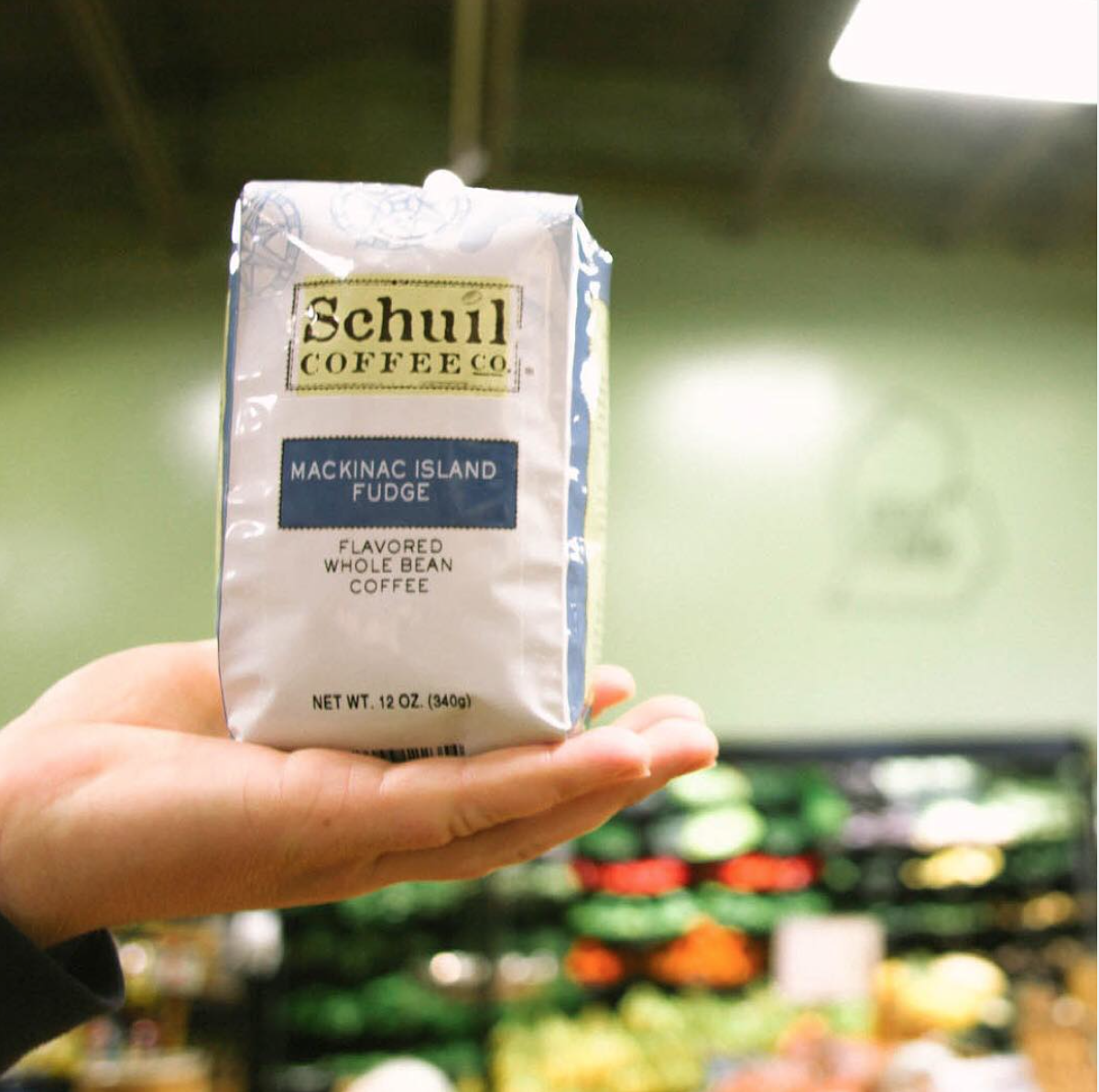
Previous Schuil Coffee Co. Branding
Process
-
We kicked off the project by exploring Schuil’s legacy as Michigan’s first specialty roaster, speaking with stakeholders, and identifying their core values. From this, we defined a brand story rooted in craftsmanship, approachability, and quiet excellence. The tone of voice was refined to be warm, confident, and grounded in tradition.
-
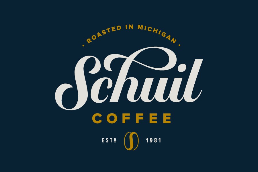
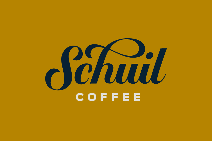
The original logo had recognition within their loyal customer base, so we approached the redesign with care. We refined the type, adjusted proportions, and introduced a subtle monogram element to modernize the mark without losing familiarity. The result is a logo that feels both elevated and enduring.
-
We developed a cohesive visual system that bridges the old and the new—pairing a muted, earthy color palette with clean serif and sans-serif typefaces. Custom graphic elements and textures nod to the handcrafted nature of small-batch roasting. Every element was designed to express Schuil’s artisanal character.
-
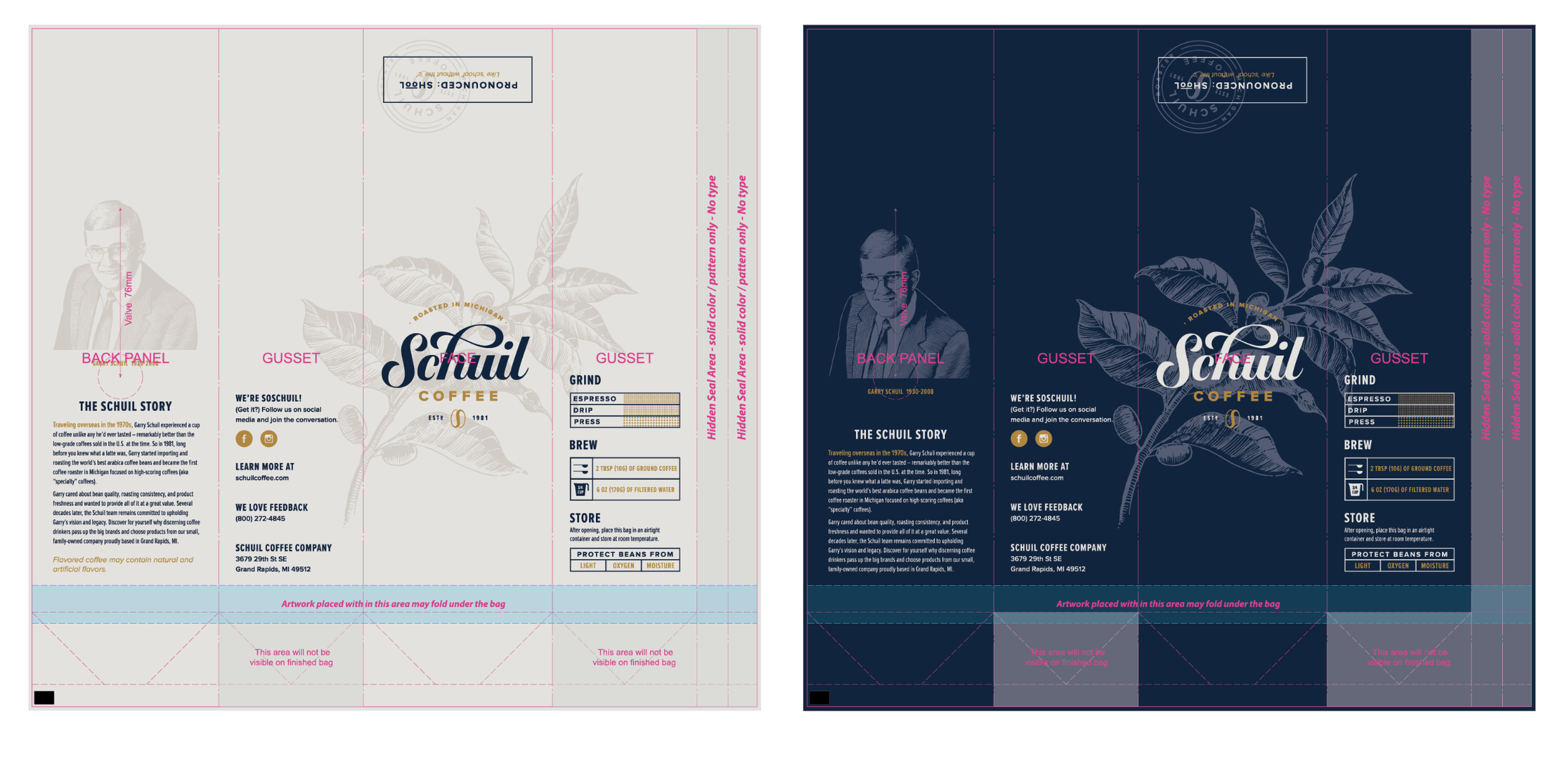
We created a flexible packaging system that could accommodate a wide variety of coffee blends and single origins. Key information—like roast level, flavor notes, and sourcing—was clearly structured to enhance readability and shelf presence. The result was a unified family of bags that felt modern, yet rooted in the brand’s legacy.
-
To ensure consistency across all touchpoints, we built a comprehensive set of brand guidelines. This included logo usage rules, color specs, typography, and layout systems for print and digital assets. These tools empowered Schuil’s internal team and vendors to maintain a strong, cohesive brand presence over time.
-
While the brand work led the project, we also updated the website to align with the new identity. Typography, color, and photography were refreshed to reflect the new look, and we simplified navigation to improve the customer journey. The refreshed site now serves as a clean, modern extension of the in-store experience.
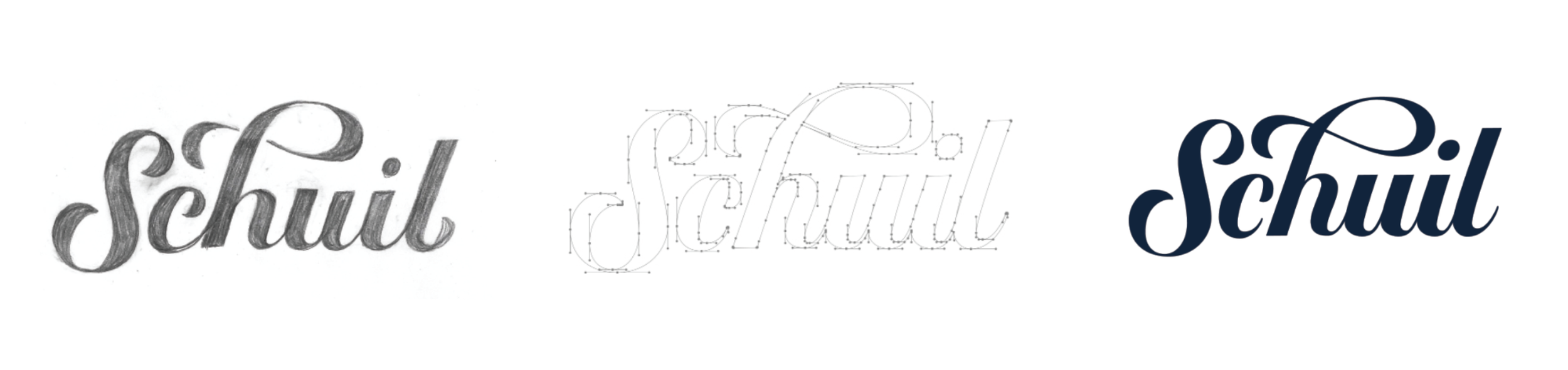
We carefully evolved the logo to balance legacy with refinement. Starting from my hand-drawn mark, we adjusted weight, contrast, and rhythm to improve legibility and visual flow. The new logotype retains its distinctive personality while feeling more confident and contemporary.
Paired with a bold, geometric “COFFEE” lockup and a flexible monogram, the updated identity adapts seamlessly across print, digital, and packaging applications.


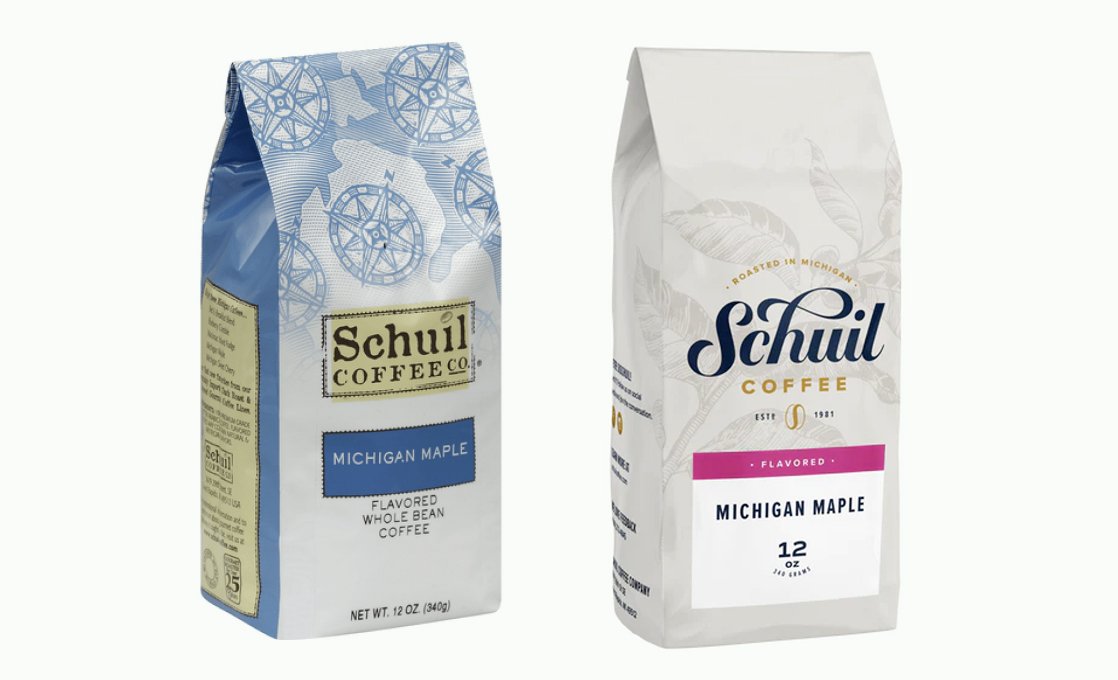
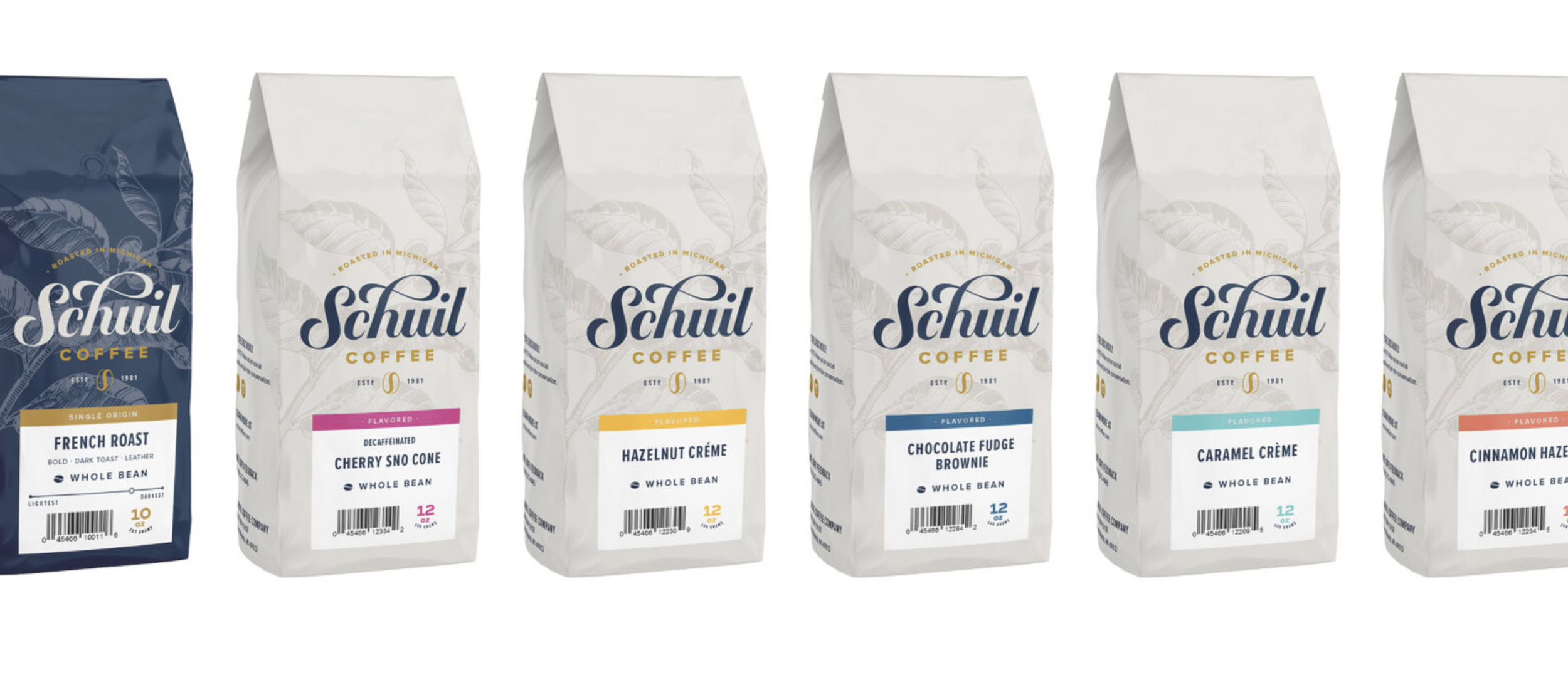
Packaging Design
We built a scalable packaging architecture that allowed Schuil to highlight origin, roast level, and tasting notes across a wide product range.
Each element—from color coding to label layout—was designed for clarity, consistency, and strong shelf presence.


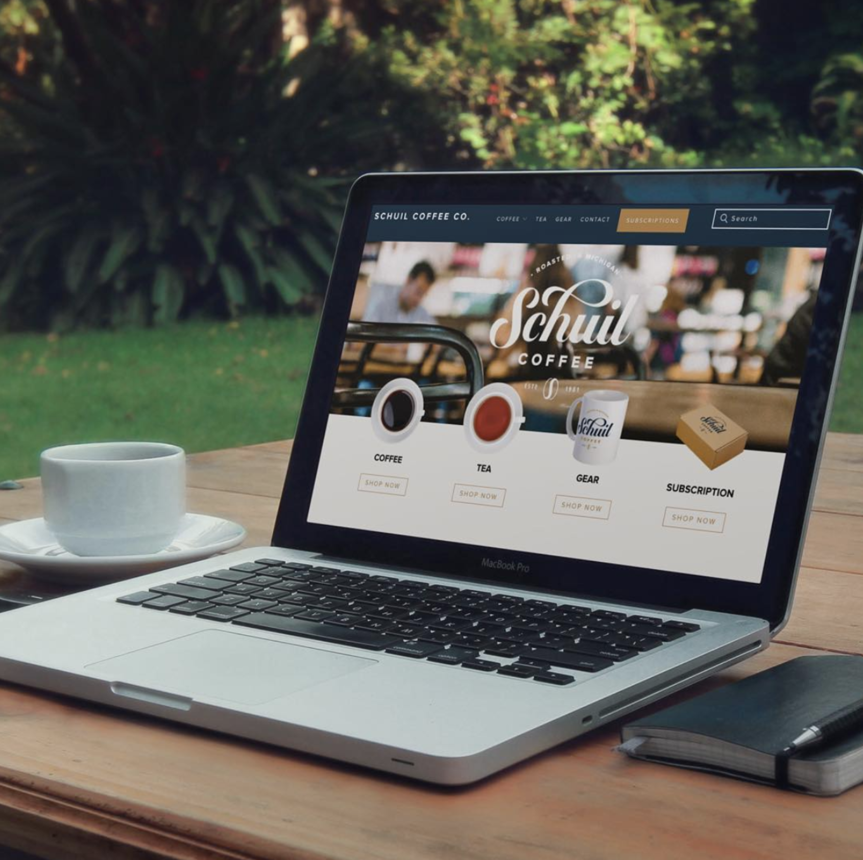
Website Refresh
We designed a clean, welcoming e-commerce experience that brought the new brand to life online. The homepage showcases Schuil’s offerings with intuitive navigation and clear calls to action, while the aesthetic reflects the warmth and heritage of the brand. Visual hierarchy, typographic consistency, and custom photography helped elevate the site while making it easy for customers to explore and shop.
Outcome
The refreshed identity elevated Schuil’s presence in a crowded specialty coffee market. The new packaging system created a cohesive and recognizable product line, while the evolved brand visuals brought clarity, sophistication, and warmth to every customer touchpoint.